Magpie Magazine
INDESIGN | PHOTOSHOP | ILLUSTRATOR
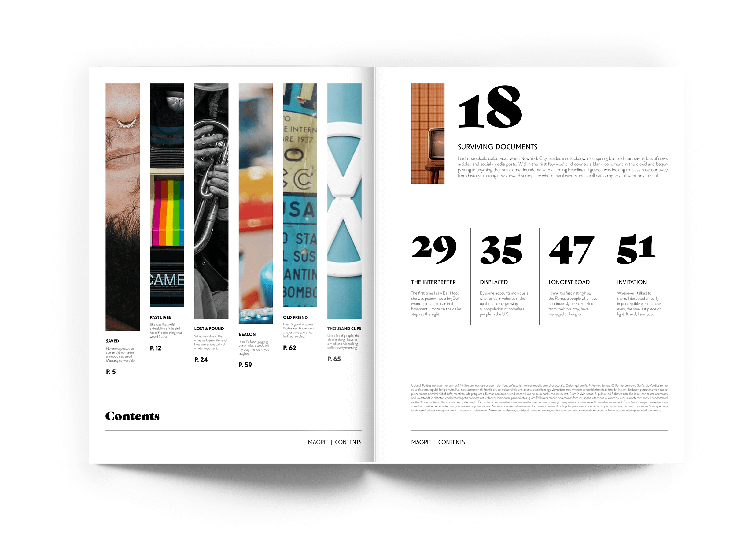
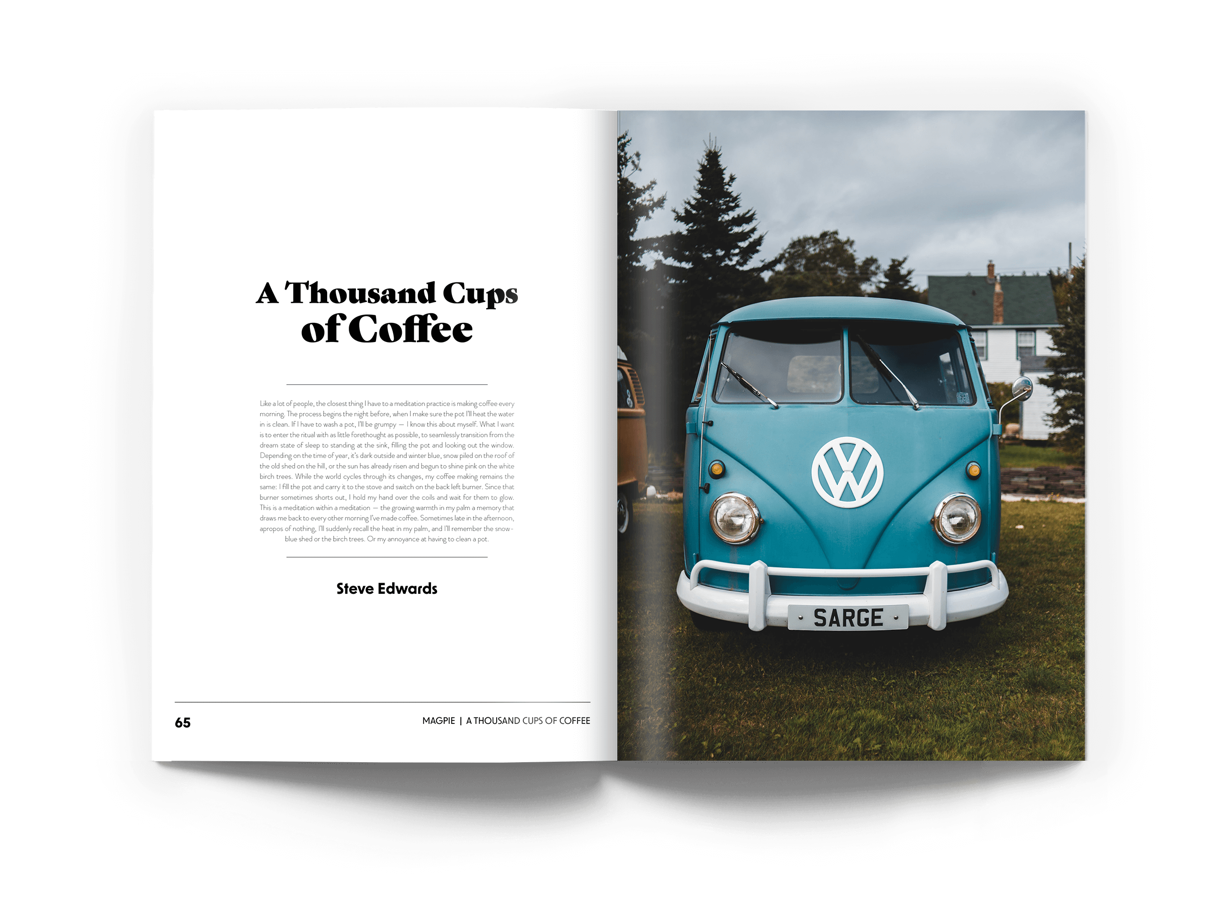
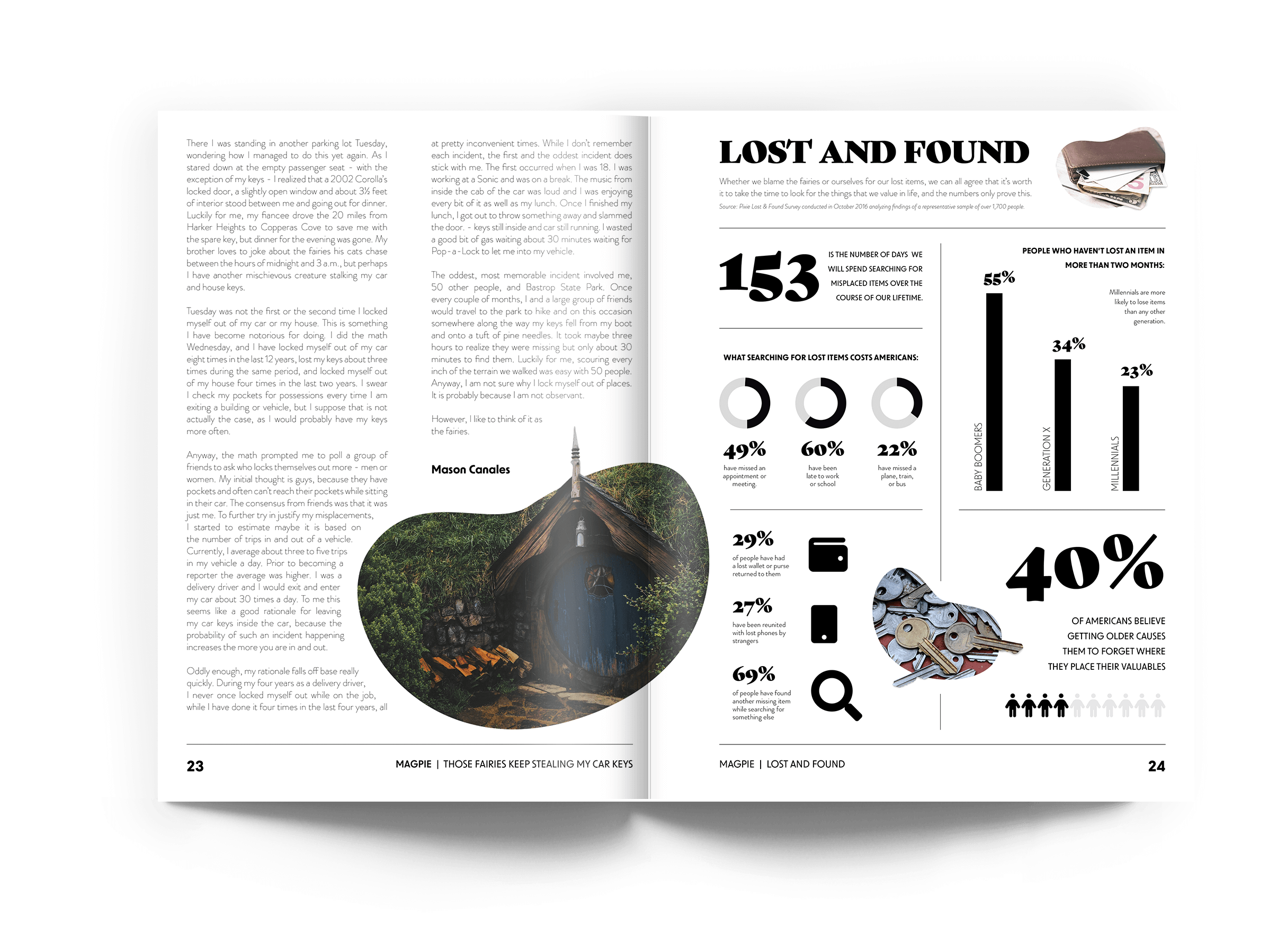
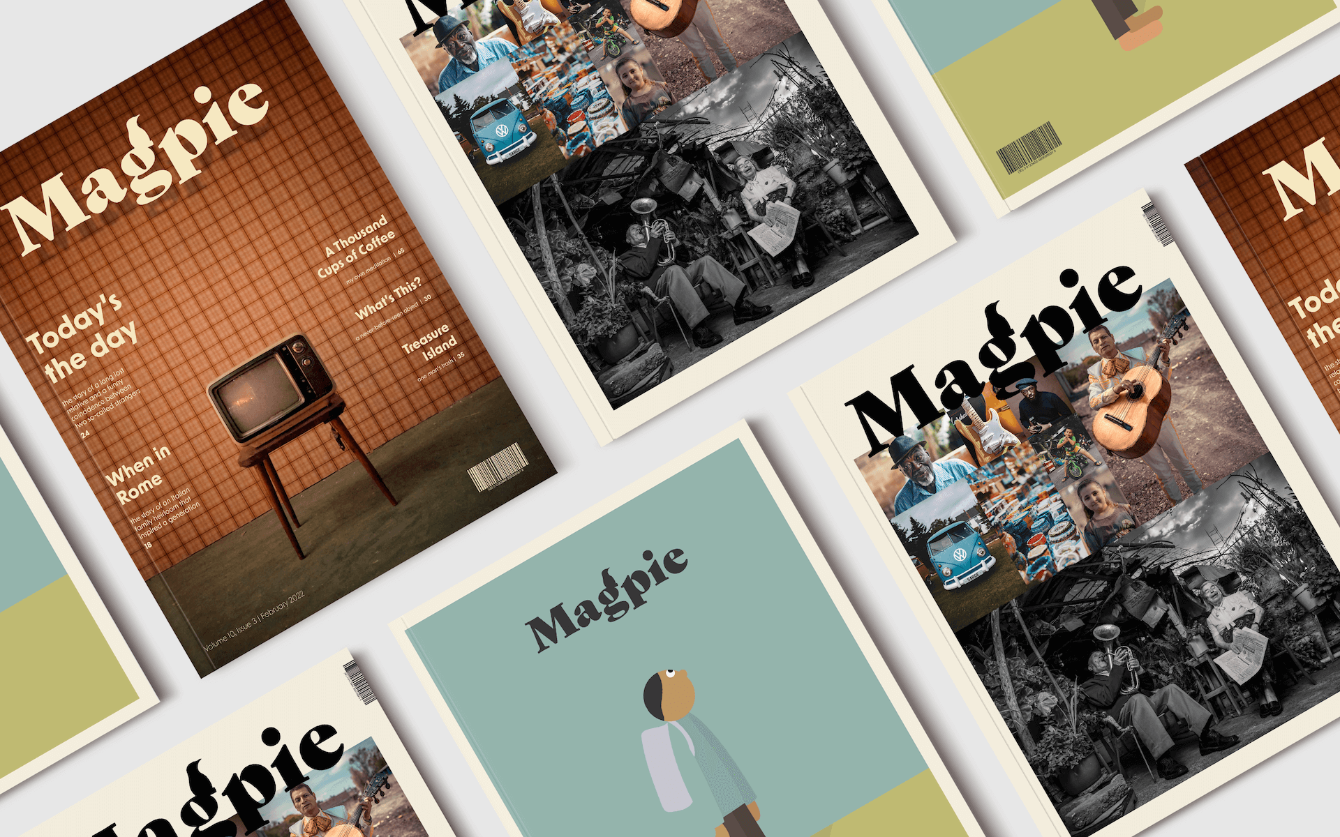
Magpie Magazine was created as a mock magazine that shares stories of people and their most meaningful objects or collections they own. It is a magazine about valuables that looks at an item’s value based on human storytelling rather than societal perception.
Through the design of this mock magazine, a simple brand identity with an emphasis on strong imagery was developed. Utilizing the Adobe InDesign interface, a collection of pages including cover pages, contents pages, and feature spreads were developed, as well as an electronic publication version with animation, links, audio, and video features. View interactive ePub version here
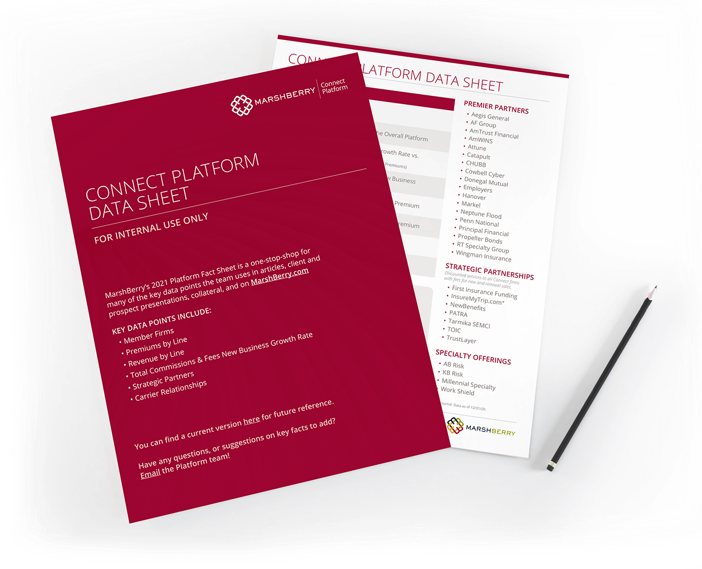
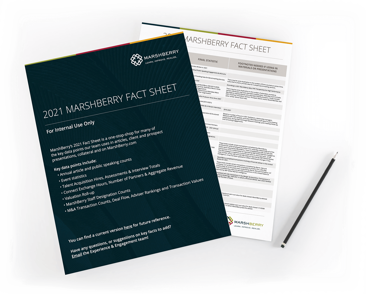
MarshBerry Data Sheets
INDESIGN | PHOTOSHOP
Employees of MarshBerry, a financial consulting company, rely heavily on financial data documents in order to conduct their financial advisory work effectively and accurately.
These fact sheets were designed to compile data points and reference points in a concise, readable layout. While communicating complex information in a simple way, these sheets also maintain the integrity of MarshBerry’s brand through color and typography.
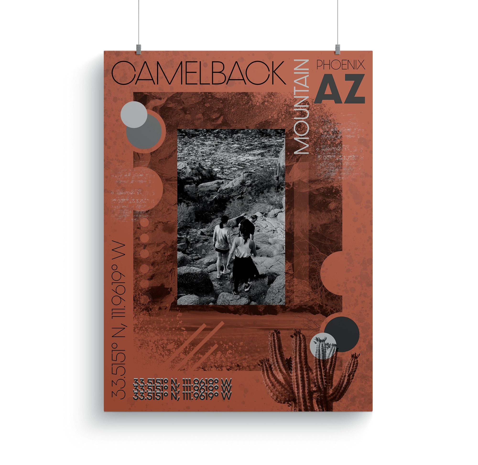
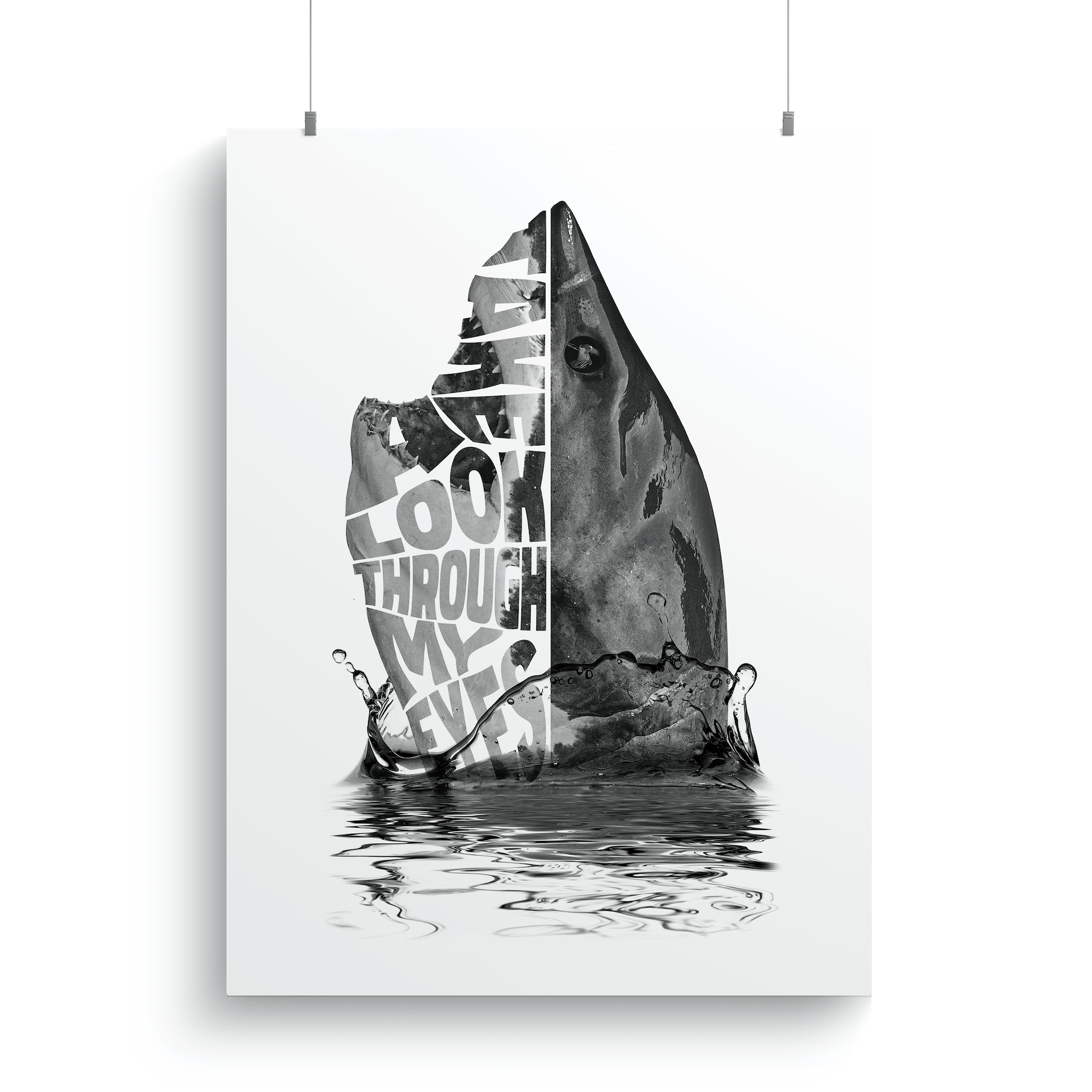
Poster Design
PHOTOSHOP | ILLUSTRATOR
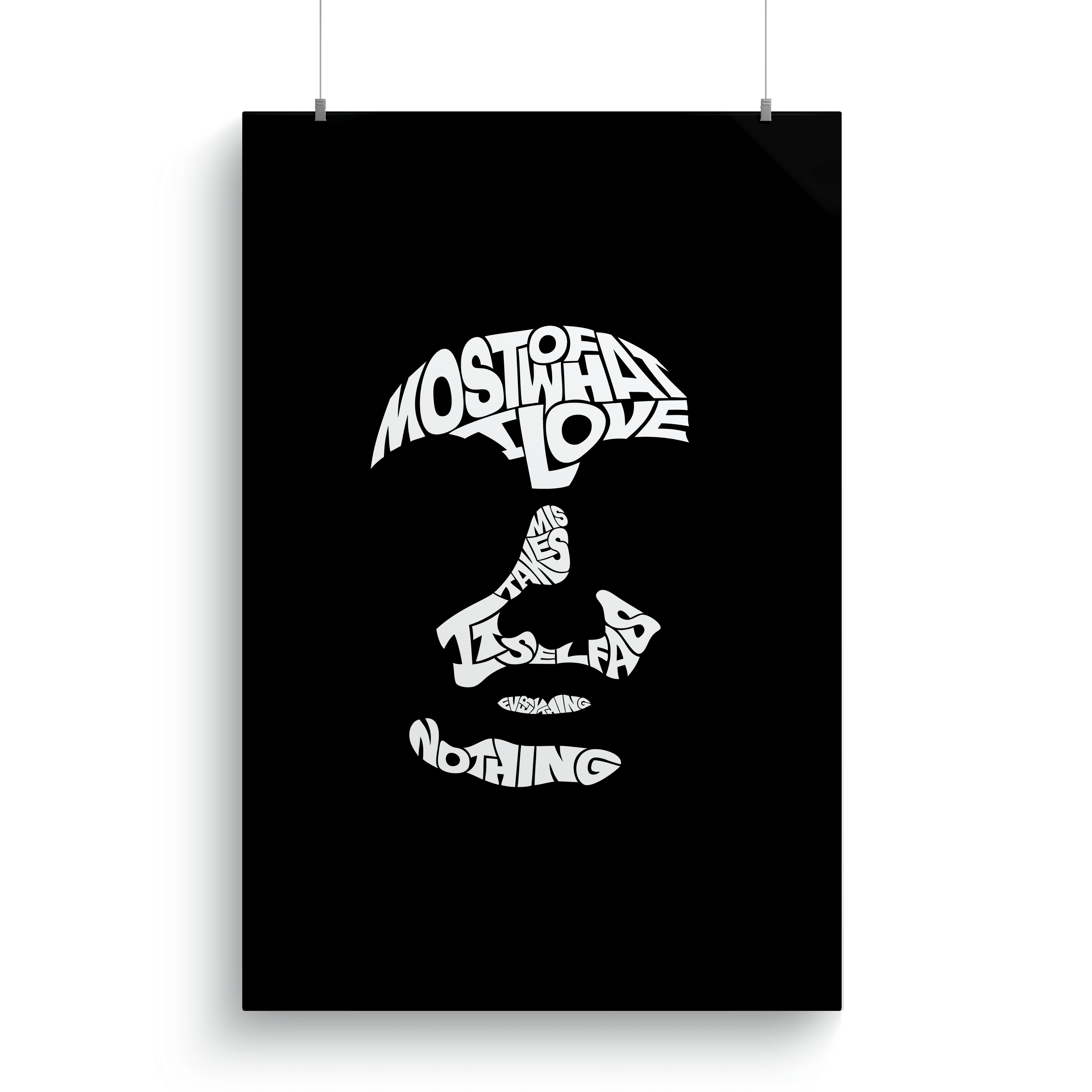
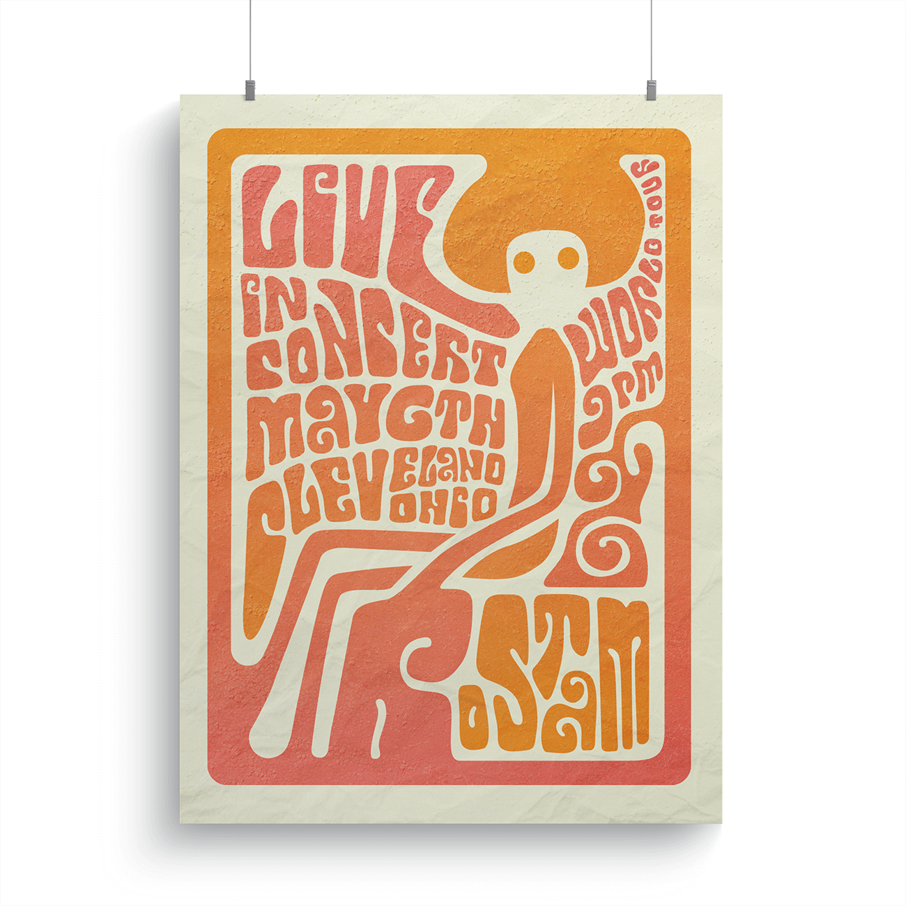
A collection of poster projects created using illustration and image manipulation skills. These include typographic portraits, a geometric travel poster, a shark finning activism poster, and a 1960s-inspired concert poster
MarshBerry Internal Newsletter Template Redesign
HUBSPOT | ILLUSTRATOR | PHOTOSHOP
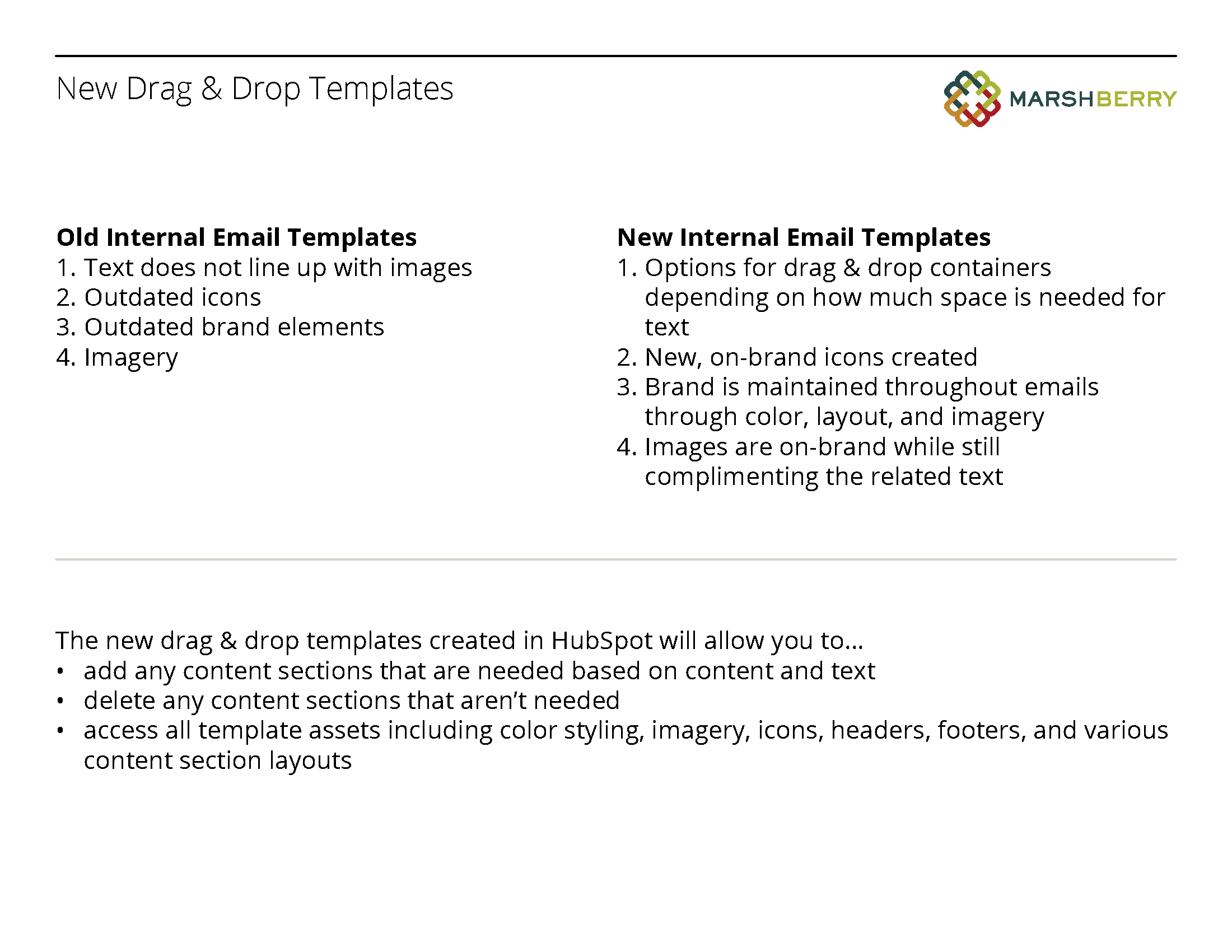
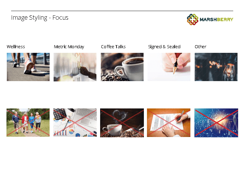
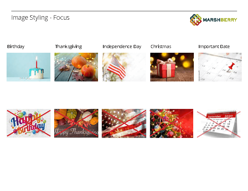
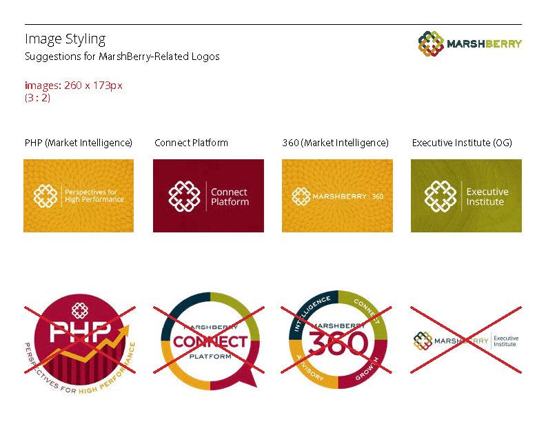
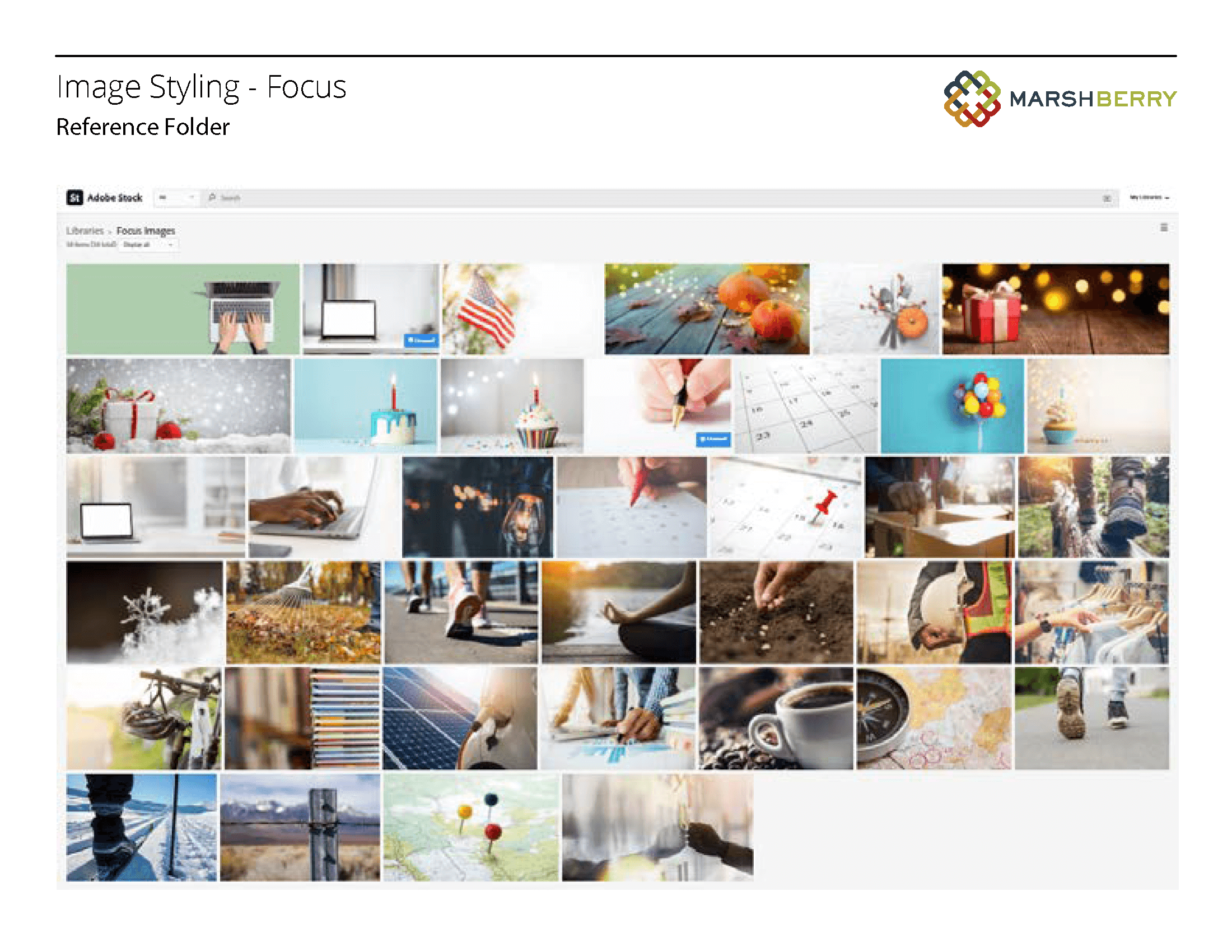
Utilizing the email marketing platform HubSpot, the old internal newsletter templates were redesigned to better fit MarshBerry’s brand and email functionality. These new templates also provide the marketing team a guide to populate on-brand copy and imagery for emails. The image styling guideline and final designs can be viewed below.
